Sixty-five percent of people are visual learners — and the brain processes images up to 60,000 times faster than text. For content creators, understanding how human vision and cognition interact is not a luxury: it is the foundation of every decision that shapes whether your work gets seen, understood, and remembered.
Visual psychology is the study of how images, color, layout, typography, and spatial arrangement affect perception, emotion, and behavior. It draws from neuroscience, Gestalt theory, evolutionary psychology, and decades of eye-tracking research to explain why some content instantly commands attention while other content vanishes without a trace.
This guide unpacks the key mechanisms — from color associations to face detection — and translates them into practical principles for anyone who creates content in the modern attention economy.
Color Psychology
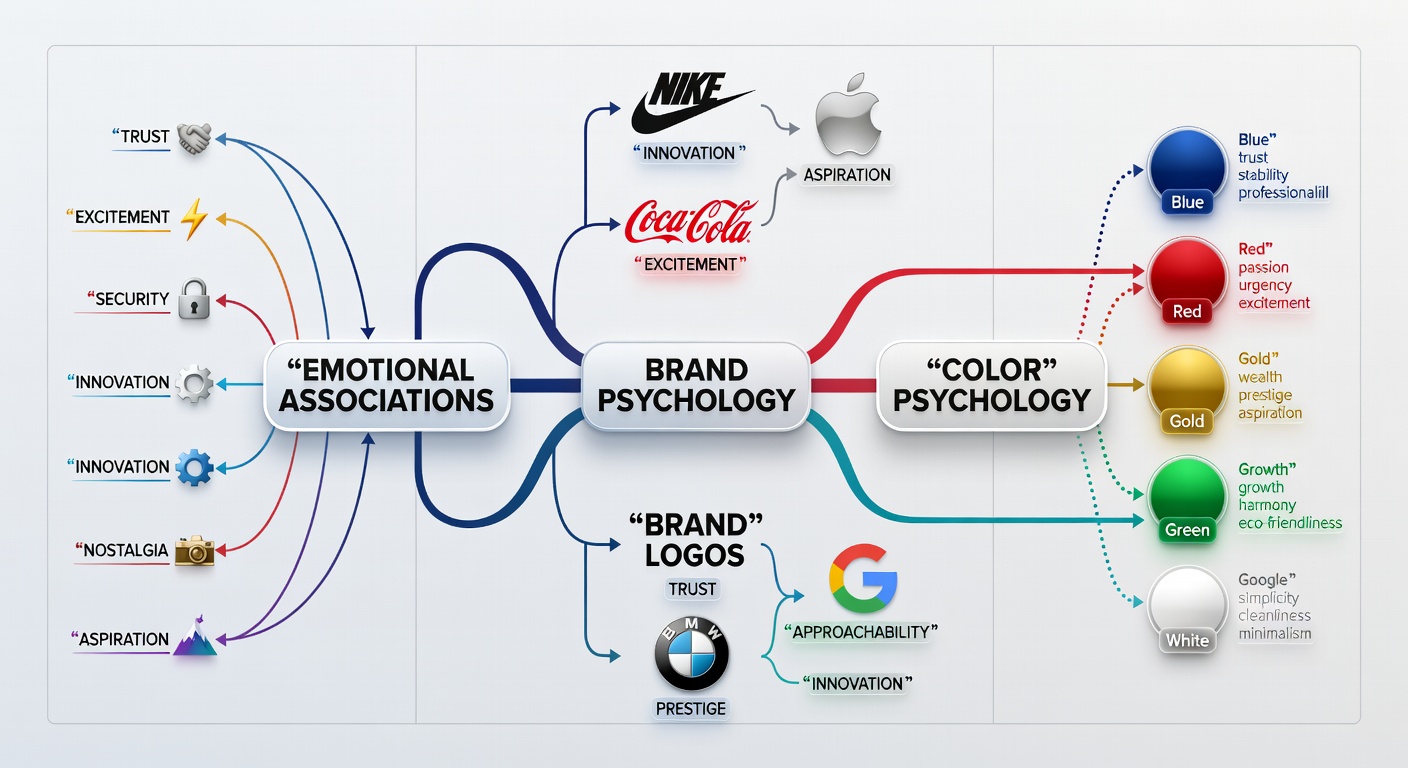
Color is one of the fastest-acting psychological triggers in the human visual system. Before a viewer consciously registers what they are looking at, color has already influenced their emotional state and attention direction. Researchers estimate that color alone accounts for up to 85% of the reason consumers choose one product over another — a finding that translates directly into content engagement.
How Green Affects Content Engagement
Green occupies the longest focal range of the human eye, meaning the eye rests most naturally on green-dominant content. Studies in environmental psychology have found that viewing green hues measurably lowers cortisol levels — the body's primary stress hormone. For content brands built around wellness, education, or long-form reading, a sage-green palette reduces cognitive anxiety and encourages longer dwell time.
Research insight: A 2019 study in the Journal of Environmental Psychology found that participants reading text on soft green backgrounds showed 14% better comprehension scores compared to those on white or red backgrounds — attributed to reduced visual fatigue.
Gestalt Principles in Content Design
Gestalt psychology, developed by German psychologists in the early 20th century, describes how the human brain organizes visual elements into unified wholes. The core insight — "the whole is greater than the sum of its parts" — has enormous implications for how content is arranged on screen or in print.
Proximity
Elements placed near each other are perceived as related. Grouping related content visually reduces cognitive load.
Similarity
Items that share shape, color, or size are grouped together perceptually — used to create content categories and visual hierarchies.
Closure
The brain fills in missing visual information. Incomplete logos and open compositions generate curiosity and engagement.
Continuity
The eye follows implied lines and curves. Content flow can be guided to direct attention to key information.
Figure-Ground
The distinction between subject and background. High contrast between these layers makes content instantly parseable.
Common Fate
Elements moving in the same direction are seen as a group. Critical for animation and video content direction.
Content designers who understand Gestalt principles create layouts that feel instinctively organized. Audiences spend less cognitive energy parsing structure and more engaging with the message — a measurable advantage in an era of shallow attention.
The Rule of Thirds & Visual Hierarchy
Borrowed from classical photography and painting, the rule of thirds divides any frame into a 3×3 grid. The four intersecting points — called "power points" — are where the human eye naturally gravitates. Placing key content, faces, or product shots at these intersections consistently outperforms centered compositions in click-through and engagement studies.
Visual hierarchy extends this principle further: by controlling the size, contrast, color, and position of elements, creators guide the viewer's eye through a deliberate reading path. F-pattern and Z-pattern eye-tracking research confirms that audiences in Western cultures scan content in predictable sequences — a pattern content creators can exploit to ensure key messages land first.
Creator tip: In YouTube thumbnails and Instagram posts, place the most important visual element at the top-left or top-right intersection of your frame. Eye-tracking data shows this positioning receives up to 40% more fixation time than dead-center placement.
Face Detection & the Human Brain
Humans are born with a dedicated neural system for detecting faces. The fusiform face area (FFA), located in the temporal lobe, activates within 170 milliseconds of viewing a human face — faster than the brain processes almost any other visual category. This ancient mechanism, evolved for survival, is now one of the most powerful levers in content creation.
Why Faces in Thumbnails Get More Clicks
Multiple large-scale studies on YouTube and social media thumbnails have confirmed that content featuring human faces consistently receives higher click-through rates than comparable content without faces. A 2021 study analyzing over 2,000 YouTube thumbnails found that thumbnails with faces received 38% more clicks on average — with emotional expressions (surprise, curiosity, joy) outperforming neutral expressions by a further 20%.
The psychological mechanism is dual: faces trigger social attention automatically (we look at what others look at — a phenomenon called "gaze cueing"), and they generate an immediate evaluation of safety, trustworthiness, and competence based on facial structure and expression within fractions of a second.
Gaze direction matters: Studies show that a face looking toward content — rather than directly at the viewer — guides audience attention toward that content. Strategic gaze direction in thumbnail design can increase on-page click rates for secondary elements by up to 25%.
Typography as Psychology
Typography is not merely aesthetic — it is psychological. The typeface you choose communicates credibility, personality, and emotional tone before a reader processes a single word's meaning. Research in type psychology reveals consistent associations that content creators ignore at their peril.
Serif vs. Sans-Serif Trust
Serif fonts — those with small finishing strokes on letterforms — are associated with tradition, authority, and trustworthiness. Academic journals, legal documents, and longstanding newspaper mastheads use serif typefaces deliberately. Readers exposed to serif-set text in research contexts rate its claims as more credible than identical content in sans-serif.
Sans-serif fonts project modernity, clarity, and approachability. They dominate digital interfaces because they render more cleanly on screen at smaller sizes. However, for long-form content — particularly educational or analytical writing — a serif body typeface measurably improves reading comfort and perceived authority.
Font Weight, Size & Authority
Heavier font weights command attention and authority. Bold text draws the eye first in an F-pattern scan — a reason why subheadings and pull quotes in heavy weights serve as navigational anchors for scanning readers. Oversized display text (above 48px) communicates confidence and is associated with premium brand positioning.
Optimal body text for reading comprehension sits between 16–18px with a line-height of 1.6–1.85 — ranges that minimize saccadic eye movement (the jumping motion eyes make between fixation points) and reduce reader fatigue over long sessions.
Video Thumbnail Psychology
The thumbnail is perhaps the single most important image in digital content — it is the visual decision point that determines whether hours of creative work get consumed or scrolled past. YouTube reports that 90% of the best-performing videos on the platform use custom thumbnails. Understanding what makes thumbnails clickable is applied visual psychology at its most commercially significant.
The Six Elements of High-Performing Thumbnails
- High-contrast color palette that pops against platform backgrounds (typically white or near-white)
- An expressive human face at large scale occupying at least one-third of the frame
- A single, clear focal point — cluttered thumbnails reduce click intent significantly
- Bold, legible text overlay of 3–5 words maximum — contrasted with a semi-opaque background
- Emotional dissonance or curiosity gap — the thumbnail implies something the title makes ambiguous
- Branding consistency — regular color and compositional patterns build "thumbnail recognition" in subscribers' feeds
A/B testing across major YouTube channels has consistently shown that thumbnails triggering curiosity or mild surprise outperform those triggering happiness — a finding rooted in the brain's novelty-detection systems, which prioritize unresolved information over completed emotional states.
Dark Patterns in Visual Design
Dark patterns are visual and interface design choices that manipulate users into decisions they would not otherwise make. They exploit the same visual psychology principles discussed above — but toward deceptive ends. Understanding them matters both because content creators encounter them on platforms and because ethical content creation requires knowing where persuasion ends and manipulation begins.
Common Visual Dark Patterns
Misdirection: Designing the visual hierarchy to draw attention toward a desired action while obscuring an alternative (e.g., a "Subscribe" button in prominent green and an "No thanks" link in tiny gray text below).
Confirmshaming: Phrasing opt-out language to induce shame — "No thanks, I don't want to grow my audience" — combined with a visual treatment that makes the opt-out feel foolish.
False urgency visual cues: Countdown timers, flashing elements, and red-tinted warnings that manufacture scarcity or time pressure around decisions that are not actually time-sensitive.
Ethical note: Research from Princeton University's Web Transparency & Accountability Project found dark patterns on approximately 11% of major e-commerce sites. Content creators who employ them may see short-term conversion gains but measurable long-term trust erosion — audiences who feel manipulated unsubscribe at three times the rate of organically converted viewers.
Key Takeaways
- The brain processes images 60,000× faster than text — visual decisions are made before conscious thought engages.
- Color is a pre-cognitive emotional trigger; green uniquely reduces stress and extends content dwell time.
- Gestalt principles explain why organized layouts feel intuitive — proximity, similarity, and figure-ground are the bedrock of readable design.
- Human faces in content activate dedicated neural circuits within 170ms, driving click-through and emotional engagement.
- Typography communicates authority and trust independently of content — serif typefaces score higher on credibility in long-form contexts.
- High-performing thumbnails combine contrast, expressive faces, and curiosity gaps rather than simply showing what the video contains.
- Visual dark patterns may boost short-term conversions but erode long-term audience trust at significant rates.
Actionable Tips for Content Creators
- Audit your brand's color palette against psychological associations — ensure your visual language matches the emotional tone you intend.
- Use rule-of-thirds grids in every thumbnail, hero image, and video composition; most editing tools have overlay guides built in.
- Test two thumbnail variants — one face-forward, one object-forward — for the next 10 videos and measure the CTR delta.
- Switch your long-form content to a serif body typeface at 17–18px with 1.8 line-height and compare average session durations.
- Audit your opt-in and subscription flows for unintentional dark patterns — remove any language or visual hierarchy that obscures user choices.
- Study Gestalt principles for 30 minutes using real examples from high-performing platforms; then redesign one content layout with these principles in mind.
- For video content, experiment with gaze-direction thumbnails where the face looks toward your text overlay rather than at the viewer.
References
- Faraday, P. & Sutcliffe, A. (1997). Designing effective multimedia presentations. CHI Conference Proceedings.
- Elliot, A. J. & Maier, M. A. (2014). Color psychology: Effects of perceiving color on psychological functioning. Annual Review of Psychology, 65, 95–120.
- Mack, A. & Rock, I. (1998). Inattentional Blindness. MIT Press.
- Todorov, A. et al. (2005). Inferences of competence from faces predict election outcomes. Science, 308, 1623–1626.
- Wertheimer, M. (1923). Laws of organization in perceptual forms. Psychologische Forschung, 4, 301–350.
- Nahai, F. (2012). The Art of Conversion. New Riders.
- Mathur, A. et al. (2019). Dark patterns at scale. Proceedings of the ACM on Human-Computer Interaction, 3(CSCW).
- Lidwell, W., Holden, K., & Butler, J. (2010). Universal Principles of Design. Rockport Publishers.
Explore the Full Psychology Library
Dive deeper into the behavioral science that shapes content — from dopamine loops to cognitive biases.