Color Psychology in Digital Content: How Hues Control Behavior
Before a single word is read, before a headline registers, before any conscious processing begins — color has already influenced how a viewer feels about your content. This is not a metaphor or marketing hyperbole. It is a neurological fact: the visual cortex processes color information within 50 milliseconds of exposure, before the prefrontal cortex has had any involvement. Color is not decoration. It is communication at the speed of perception.
For digital content creators, this means that color decisions are behavioral design decisions. Every palette choice either works for your goals or against them. Understanding the psychological architecture of color is one of the highest-leverage skills available to anyone building content in the digital space.
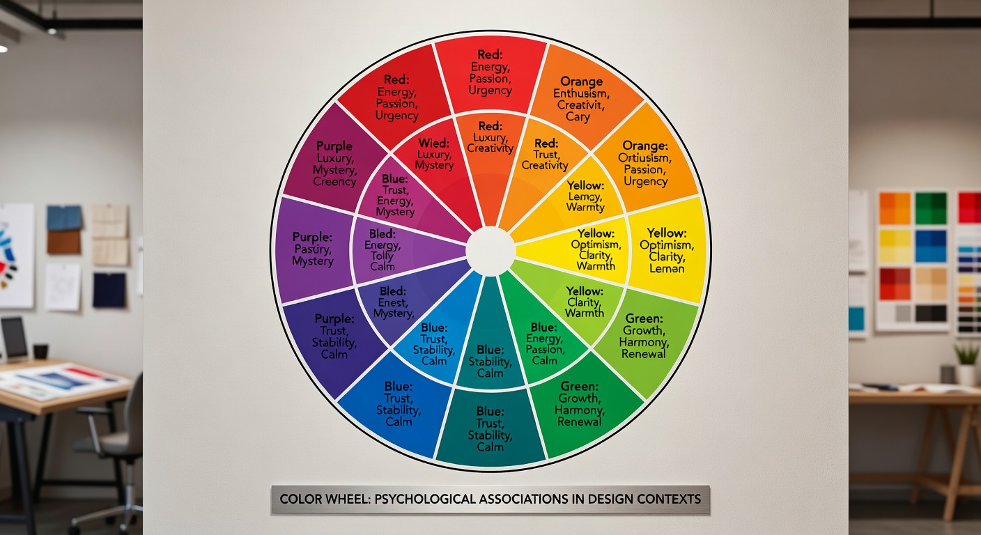
The Psychological Effects of Key Colors
Color psychology is not an exact science — cultural context, individual experience, and saturation levels all modify how colors land. But broad patterns emerge consistently across research populations, and these patterns are reliable enough to be actionable.
Cultural Differences in Color Perception
No discussion of color psychology is complete without acknowledging that color meaning is not universal. The Western associations outlined above represent one cultural framework — and a relatively narrow one at that.
White, for instance, is the color of purity and weddings in Western contexts but of mourning and funerals in many East Asian cultures. Red, which signals danger in North America, is the color of luck, prosperity, and celebration in China — which is why Chinese New Year imagery is saturated with it and why Chinese tech companies frequently build their primary brand colors around red.
"Color speaks before language. It bypasses the thinking mind and reaches the feeling body first. That is either your greatest asset or your most costly oversight."
— Yuki Mori, Visual Content Researcher, PhysGreen carries financial connotations in the United States (the color of the dollar) but is associated with danger or illness in some South American contexts. Purple, luxury and royalty in Europe, is associated with mourning in Thailand and Brazil.
For digital content targeting global audiences, this means that culturally specific color meanings need explicit research. The safest cross-cultural choices tend to be blue (universally positive) and the warm neutral family. Beyond that, localization of color palettes for different regional audiences is a high-value investment that is frequently overlooked.
Color in CTAs and Conversion Optimization
No domain has generated more A/B testing data on color than conversion rate optimization (CRO). The findings, taken in aggregate, reveal some consistent patterns — though the popular claim that "orange CTAs always outperform" is a dangerous oversimplification.
What the research actually shows is that CTA color performance is almost entirely determined by contrast against the surrounding design rather than by absolute color value. A red button on a blue background can outperform an orange button on a yellow background, not because red is inherently superior to orange, but because contrast creates visual salience and salience drives clicks.
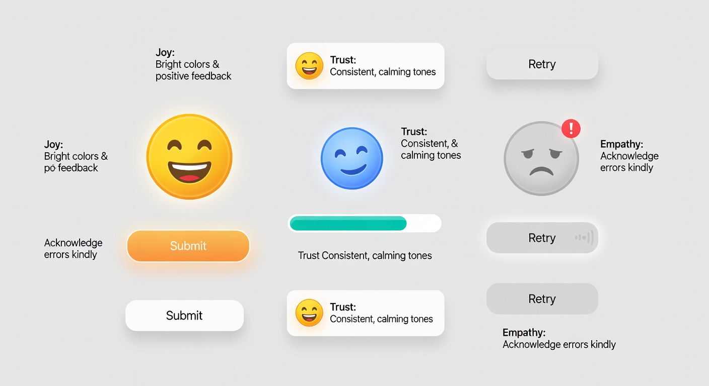
The secondary factor is semantic alignment: the emotional meaning of the CTA color should match the emotional context of the conversion. A healthcare app asking for a medical record upload should not use a fire-engine red button — the urgency connotation conflicts with the trust requirement. A muted sage green or authoritative blue better serves the emotional architecture of the moment.
The Psychology of Brand Color Consistency
Consistent color use across a content brand creates what psychologists call "mere exposure effect" — the well-documented phenomenon where familiarity breeds positive regard. When audiences repeatedly encounter the same color palette across your content, they develop an unconscious positive association with those colors that transfers to your brand as a whole.
Practical Color Palette Guide for Content Creators
- Primary brand color: One dominant hue that carries your core emotional proposition. Test against your audience's cultural context before committing.
- Secondary accent: A complementary hue that appears in CTAs, highlights, and key visual moments. Should contrast clearly with your primary.
- Background family: Typically a neutral — warm white, cool gray, or sage light. Reading comfort depends critically on sufficient contrast with text.
- Text color: Near-black rather than pure black (#000000). Pure black on white creates harsh contrast that increases reading fatigue over long form.
- Warning/alert color: Keep red or amber reserved exclusively for error states and critical alerts. Diluting this semantic meaning costs user experience enormously.
- Maintain a 4.5:1 contrast ratio between text and background to meet WCAG accessibility guidelines — and because it is simply easier to read.
How Sage and Muted Tones Affect Reading Experience
One of the most interesting areas of recent color psychology research concerns the specific effects of desaturated, muted color palettes — what designers often call "sage," "dusty," or "organic" palettes — on reader experience and trust.
Studies on typography and reading environment consistently find that muted, warm, or cool-neutral backgrounds reduce cognitive load during extended reading compared to high-saturation alternatives. The visual system processes highly saturated colors with greater effort, and that effort competes with the cognitive resources needed for reading comprehension.
Sage green in particular occupies an interesting psychological position. It carries the trust and growth associations of green while the desaturation removes the intensity that can feel aggressive or commercial. This combination — trustworthy, calm, natural, and sophisticated — is why sage has become the dominant color in wellness, slow media, premium editorial, and conscious consumer brands. It signals "we are not trying to alarm or excite you; we are here to inform and nourish."
For long-form content designed for deep reading — research articles, essays, educational content — muted palettes serve the reader by minimizing visual noise. For short-form content designed for quick action, higher-saturation elements draw the eye to the key conversion moments. The art lies in calibrating the tension between calm and activation to match your specific content purpose.
Color is never neutral. Even the absence of deliberate color choice is a color choice — one that typically defaults to the generic aesthetic of the platform rather than the intentional aesthetic of the brand. The creators who understand color as behavioral design will always have an edge over those who treat it as decoration.
Join the Discussion
Curious about color choices for a specific platform or audience? We enjoy thinking through these questions with creators and designers.
Start a Conversation →